They say don’t judge a book by its cover . . . but we all do.
The attractive or interesting cover draws us to the tome. We pick it up. Then read the title. If that’s captivating we flip back to the blurb. Now the blurb has to do its work . . .
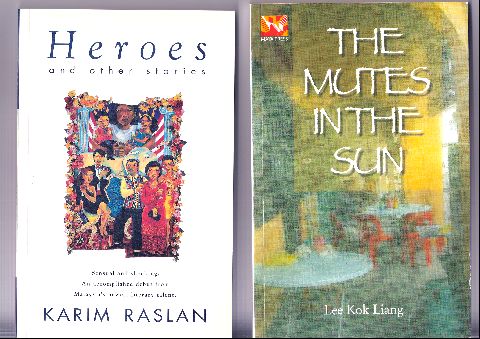
Here’s a couple of covers from local books published a few years back.
Which would you pick up? Which draws you to it?
Both are literary, competing for the same readership.
The cover of Heroes and other stories by Karim Raslan is sharper, better designed and exhibiting intriguing character illustrations. Lee Kok Liang’s is more muted – well the title is The Mutes in the Sun. I like the mystery it evokes though. I like its simplicity
Here’s a couple more:
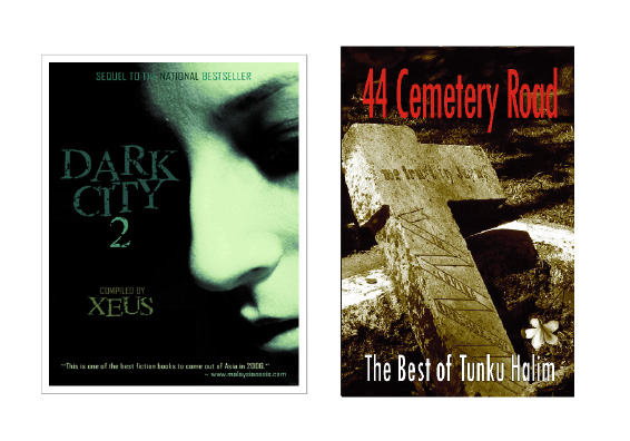
I really go for Xeus’s Dark City 2. She has had the benefit of the multi-talented Kenny Mah’s graphic design skills. The woman face emerging from shadows of suspense and fear promises a wonderful read. I’ve got a story in it – “Hawker Man”, my first story after 5 years in the non-fiction wilderness.
Of course, I like my 44 Cemetery Road too. I have to. It’s my book and I also snapped the cover photo. I shot it at the old cemetery in George Town whilst I was scurrying amongst the gravestones looking for Francis Light’s place of rest. What a beautiful frangipani filled afternoon that was!
What my cover lacks though is a human face. The human face is so arresting, capturing out attention. It always does.
No doubt Dark City 2 will work its magic. I hope a few hands will grab the gravestones in 44 Cemetery Road too. There are 21 of them – tales written over 10 years and out this month!
We know the cover is vital to a book’s success. Writers and publisher’s must focus more on this. Our local books, without any form of government funding, must compete commercially with beautifully designed imported books.
Hence front cover becomes vitally important.


April 2, 2007 at 3:19 am
hmm I think cover does plays big role in selecting books. so far I love covers from Amitav Gosh’s like The Glass Palace. I also like Amy Tan’s Saving The Fish From Drowning, the one that depicted a fisherman with a net.
April 2, 2007 at 5:59 am
Interesting… you chose your examples well… we could say the same for appearances when we choose partners, at least in the first few instances…
April 2, 2007 at 6:44 am
“we could say the same for appearances when we choose partners, at least in the first few instances…”
Hee hee. How true, Lrong. Thanks for using my cover as an example, Tunku. Flattered lah…
And you tukar blog template lagi! Like changing clothes lah, hee hee. This time it’s a bit creepy since me and another blogpal of mine is using this one too. 😉
April 2, 2007 at 9:13 am
Tunku,
i love the photo you took for the cover of 44 Cemetery Road, with the shadows and the flower next to it. really nice…=D
April 2, 2007 at 9:38 am
TH, Kenny the best lah! Next time you can also hire him to design your cover for you. Wah! Kenny getting reputation everywhere!
I like the 44 Cemetery Road Cover now that it’s in color. But I’ve learnt from experience that a human face really does sell more books, especially if it’s a beautiful woman’s.
April 2, 2007 at 10:34 am
Yes Kenny’s rather multi-talented, isnt he.
TH:I like Xeus’s cover better. I’d prefer if the picture of the cemetery was taken at night! It’ll be creepier!
April 2, 2007 at 12:03 pm
Nice job here, T Hal. The first cover is striking but then the muted one tells me it could be more profound. Your cemetery cover is very well done indeed – can’t wait to get the book when I next go to M’sia.
(You did it! I’ve been wanting to photograph something that will become the cover of my future book – I can but hope. Sometimes I pass a house with a colourful papier-mache elephant on the balcony; after a snowfall it gets a blanket of white – sounds like an interesting visual, eh?)
April 2, 2007 at 11:09 pm
Sang Diva – yes, the cover is vitally important. We live in a superficial world, don’t we?
Lrong – yes a book is very much like a partner, kept close for days on end but hopefully not then discarded.
Kenny – you’ve done a wonderful job with Dark City 2. You could call using the same theme a coincidence, but are there other powers at work?
Spiffy – thanks for the compliments on the photo. I normally take awful shots but sometimes magic happens.
Xeus- yes must hire Kenny for my next book. A human face is definitely better, but who’s going to be the model?
Quiet Storm – Dark City 2 is better because Kenny worked hard at it. The 44 Cemetery Rd cover went thru a rather simple design process. But it is rather poignant for the book’s contents. BTW I wouldn’t dare go in to take photos at night!
Argus – the Lee Kok Liang book has real depth and feeling and so well written. Glad you liked the 44 Cemetery Rd cover. My visit to the cemetery was for my encyclopedia project. It was only later that I realised the shot would work well for 44 Cemetery. Perhaps the snow covered elephant provides that germ of an idea for your novel?
April 3, 2007 at 10:49 am
I think it’s more than just superficial. It’s human nature, our eyes like something simple and refreshing.
April 3, 2007 at 10:50 am
I agree with Xeus, your cover looks much better in colour than the B&W version we saw at Lydia‘s last book talk.
However, I think it works fine without a human face, largely because it’s such an evocative image you managed to capture, and by accident at that! 🙂
April 3, 2007 at 11:21 am
I like both the covers of Dark City II and 44 Cemetery Road. Sometimes afternoons can be spookier than midnight.
April 3, 2007 at 10:15 pm
Sang Diva – yes, what can match beauty? It is definitely most pleasing to the eye.
Kenny – yeah colour is better, I think Xeus or yourself suggested putting the colour in. Most grateful indeed.
Bookmaniac – thanks! in the afternoon you can see all the graves watching you in the quietude.
April 4, 2007 at 3:39 am
Tunku Halim, you’ve changed template. For a moment I thought I was at Kenny’s. Looked at the header again and saw, Write Lah! to confirm it’s yours.
If you didn’t say Karim’s book was literary, I would’ve thought it was a light read. Mutes in the Sun’s cover is suited to its genre. It looks literary all right.
As for your cover, I really like it, especially the frangipani in the corner. DC 2’s cover is foreboding in a subtle manner whereas 44 CR promises blatant horror.
April 4, 2007 at 5:29 am
Lydia – as Kenny says “tukar baju”, but only for the moment. Glad you like the cover, but unfortunately the latest news isn’t too good.
Just heard that MPH has second thoughts about the cover for 44 CR. No reason given. Possibly the gravestones are too close for comfort. Imagine all those gravestones piled up and staring at you in the bookshop . . . enough to give you the creeps and put an end to all your Feng Shui dreams.
Superstition may be the reason. It’s still a powerful force in Malaysia. Hmmm . . . what to do?
April 4, 2007 at 7:47 am
aiseh, TH…2nd thots about the cover?? i honestly don’t think ur cover’s creepy..to me it’s has that rustic feel to it..makes me wanna grab the book immediately. but then again, i’m not really a big fan of creepy & scary looking covers. hahah…
*crossing fingers they’ll stick to the original*
April 4, 2007 at 11:42 am
T Hal, methinks it’s the remnants of a cross (the gravestone) folk think might ‘offend’ some.
Manyak susahlah M’sia punya market! Haiya, all right.
April 4, 2007 at 11:44 am
Or is it the words on the gravestone?
I can’t really read them. Are they “We trust in …”?
April 4, 2007 at 4:01 pm
Hey, Argus, I think you’ve hit the nail on the coffin, er, head.
April 4, 2007 at 11:31 pm
Argus & Lydia – not sure lah if it’s the cross or the inscription . . . maybe just the grave lah.
Why tempt fate? I think that’s the concern. “Why put grave there, you want die ah?”
Anyway, keeping fingers crossed (hah hah!)
April 5, 2007 at 8:58 am
I think, it’s a plain paranoia. It’s the Malaysian thing. People are so afraid of death, even gravestones is taboo or bad luck.
April 5, 2007 at 10:01 am
But it’s a collection of horror and scary stories, no?
Anyway, T Hal’s graveyard photo is lovely and evocative, not frightening at all.
April 5, 2007 at 10:55 am
Now for some ‘comic’ relief, please come and play my ‘Silly Word Game’ on my blog. Everyone is invited. (Sorry, Hal, for this plug.)
April 5, 2007 at 12:46 pm
TH, maybe it’s because MPH feels uncomfortable that the relatives of the poor deceased person beneath that gravestone might mount a lawsuit?
April 5, 2007 at 6:16 pm
Whoa, TH, someone’s been busy! Every time I come back here you have a new template. Is nice. I like!
That gravestone cover looks really creepy though, but you’re right, it might offend fragile Malaysian sensibilities. (Over here it’s all over the news about Parlimen bashing the Top Gear host for trashing the Perodua Kelisa.) Still, I like it. Is that really Francis Light’s gravestone??
April 6, 2007 at 10:34 am
Did they say exactly what reservations they had about your cover, Tunku?
April 8, 2007 at 11:55 pm
Sang Diva – like other nefarious things, superstition is alive and well in Malaysia!
Argus – I agree the gravestone is lovely, if I say so myself. I actually enjoy visiting graveyards 🙂 Will visit your plug . . .eh blog!
Xeus- ah how your mind works! Perhaps this could be the germ for a new story?
Angry Medic – we Malaysians verly sensitive lah! It’s not Francis Light’s gravestone . . . I can post that one up if you like. It’s in the same cemetery though – in Georgetown.
Kenny – you sound like a lawyer! Actually no. But I surmise that’s the reason. There were reservations even with the title “44 Cemetery Rd” . . . you know “die die”!
April 12, 2007 at 3:46 am
TH, your rape of martha teoh is ermmm disturbing….. made me look back twice
April 12, 2007 at 4:38 am
Sang Diva – there are 2 versions of the cover. The original version is more “sexy”, the current one (using the same photo) is more scary. Most people I reckon preferred the first as it sold the fastest!
April 19, 2007 at 9:13 am
my first was when i was 17 — waiting for SPM result. it’s titled “skrip”. love it as it’s the only story that i actually finished writing.
April 20, 2007 at 4:48 am
Petaling Street – the question is, do you want to finish more stories?